Industry Food Technology
Timeline Ongoing
Type Service Prototyping | Brand Packaging

Casa Project

A modular packaging and product system that lets one food-technology brand prototype, launch and scale new SKUs across categories — while staying instantly recognisable on a crowded shelf.

Casa is a food-technology company moving a broad portfolio — potato chips, macaroni chips, rice and organic coconut sugar — into competitive retail. Every new flavour was being designed from scratch, so the range was growing faster than its identity could hold together.

I approached the pack not as artwork but as a service touchpoint — the first conversation Casa has with a shopper — and built a system that turns each new SKU into a fast, repeatable prototyping exercise instead of a redesign.

The Challenge

Casa was scaling faster than its packaging could keep up.

The portfolio already spanned several categories, but each flavour and product was commissioned on its own. On shelf, the range read like a handful of different brands rather than one.

There was no shared template, no logic linking flavour to colour, and no fast path from idea to a print-ready prototype the team could test before committing to production.

Key Pain Points
  • Every SKU designed from zero — no shared template
  • Weak family resemblance across flavours and categories
  • Flavour confusion at shelf with no consistent colour logic
  • Slow, costly path from concept to print-ready prototype
  • Nutrition and compliance panels rebuilt for each product

Research Insights

Shelf observation and portfolio analysis surfaced three patterns that reframed the brief.

01

Shoppers read colour before they read words. On a busy shelf, flavour is recognised through a consistent colour system — not the flavour name.

02

A portfolio is a promise. Trust transfers between products only when they visibly belong to one family.

03

Speed is a design problem. Casa didn't need prettier bags — it needed prototyping a new SKU to be repeatable and low-risk.

Solution Framework

The system was structured around three operating parts — designed to be reused, not redrawn.

Part 01

Master Pack Template

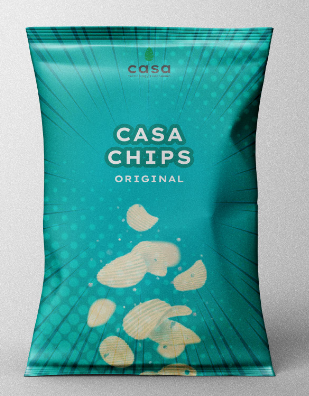
One fixed architecture — logo lockup, title block, flavour descriptor, motif field, product-fall zone and a compliance strip — shared by every product.

Part 02

Flavour Colour System

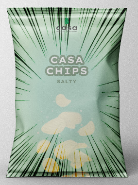
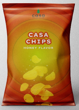
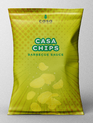
Each flavour and category owns a colour token. A single rule maps flavour to palette, so the range is navigable across the whole shelf.

Part 03

Prototyping Kit

Reusable components — front and back, 3D mockup and flat dieline — so a new SKU is assembled and tested in hours, not drawn from scratch.

The System

A single pack architecture that flexes across flavour and category.

  • A. Logo lockup
    Fixed position, fixed scale — the constant that signals "this is Casa" at distance.
  • B. Title & flavour block
    Same grid every time; only the flavour word and colour change.
  • C. Motif field
    Halftone, sunburst or speed-lines — one texture per family, recoloured per SKU.
  • D. Product-fall zone
    The appetite cue: product falling into frame, shared across the range.
  • E. Compliance strip
    Reusable nutrition panel, origin mark and certifications — built once.

Feature 01

One template, many SKUs

The architecture is locked so a new product slots into a proven layout instead of starting a blank canvas.

Feature 02

Flavour by colour

A colour token per flavour lets shoppers find what they want by sight before they read a single word.

Feature 03

Cross-category consistency

The same logic carries from chips to macaroni chips to pantry staples like rice and coconut sugar.

Feature 04

Compliance built in

Nutrition, origin and certification live as shared components — never rebuilt for a new pack.
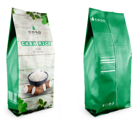
Casa Project Master Pack
01 Master Pack Concept
Casa Chips Original Flavor Pack
02 Casa Chips — Original
Casa Chips Salty Flavor Pack
03 Casa Chips — Salty
Casa Chips Honey Flavor Pack
04 Casa Chips — Honey
Casa Chips Barbecue Flavor Pack
05 Casa Chips — Barbecue
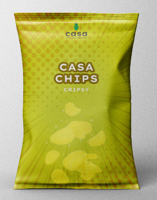
Casa Chips Crispy Flavor Pack
06 Casa Chips — Crispy
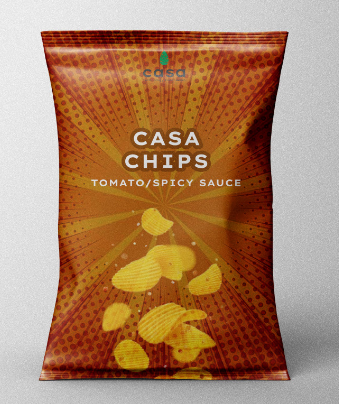
Casa Chips Tomato Flavor Pack
07 Casa Chips — Tomato
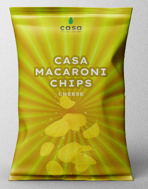
Casa Macaroni Chips Pack
08 Casa Macaroni Chips
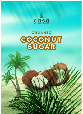
Casa Coconut Sugar Pack
09 Casa Coconut Sugar

Impact

The system changed how Casa operates its brand — not just how a single bag looks.

New SKUs prototyped in hours, not weeks

One recognisable family across every category

Flavour found by colour, at a glance, on shelf

Lower design and print iteration cost

Compliance handled once, reused everywhere

A brand the team can run without redrawing it

Reflection

"Packaging isn't the last step of a product — it's the first conversation the brand has with the shopper."

By treating the pack as a service touchpoint and the design as a system, Casa stopped commissioning artwork and started operating a brand — one that can grow a SKU at a time without losing the thread that ties the whole shelf together.

Explore More Work

Let's build
something
valuable.

Have a project in mind? I bring strategic research and service design into your next initiative. Let's have a conversation about what's possible.

Start a Conversation